Sunday, 30 January 2011
Final Idea - Toy Cars Poster
This sheet showcases another one of my projects and the final outcome from the many weeks of researching, collecting and developing. The 4 smaller images are the ideas I was deciding between, whilst the main image is my final design chosen. The idea behind this project was to advertise for a toy car exhibition, looking at cars through the ages. I believe the images are appropriate to show a shift in time, as well as the text helping to advertise.
Own Photos - Technology
This sheet aims to show the photos I took for my second, extended, project. The idea was to produce a poster advertising an internet café, so technology themed photos were appropriate. Of course, the photos wouldn't be used in their raw format, and would later be edited to be usable for a poster to advertise.
Final Designs (unit 3)
An example of the final designs from my latest project focussing on producing a poster advertising the work of the film director Chris Nolan. This final poster is advertising the 3 film posters I already produced (left hand side), and wanted to produced a combination of the 3. All of the posters include my own work, whilst still showing some artists influence.
Saul Bass Copy
Shown here is a part of one of my research pages focussing on specific artists, from my latest project. This page shows how my work isn't just limited to computer work, as I have used card to try and recreate work in the style of the artist Saul Bass. The text was all created on the computer, making it easily legible.
Manchester Vertical
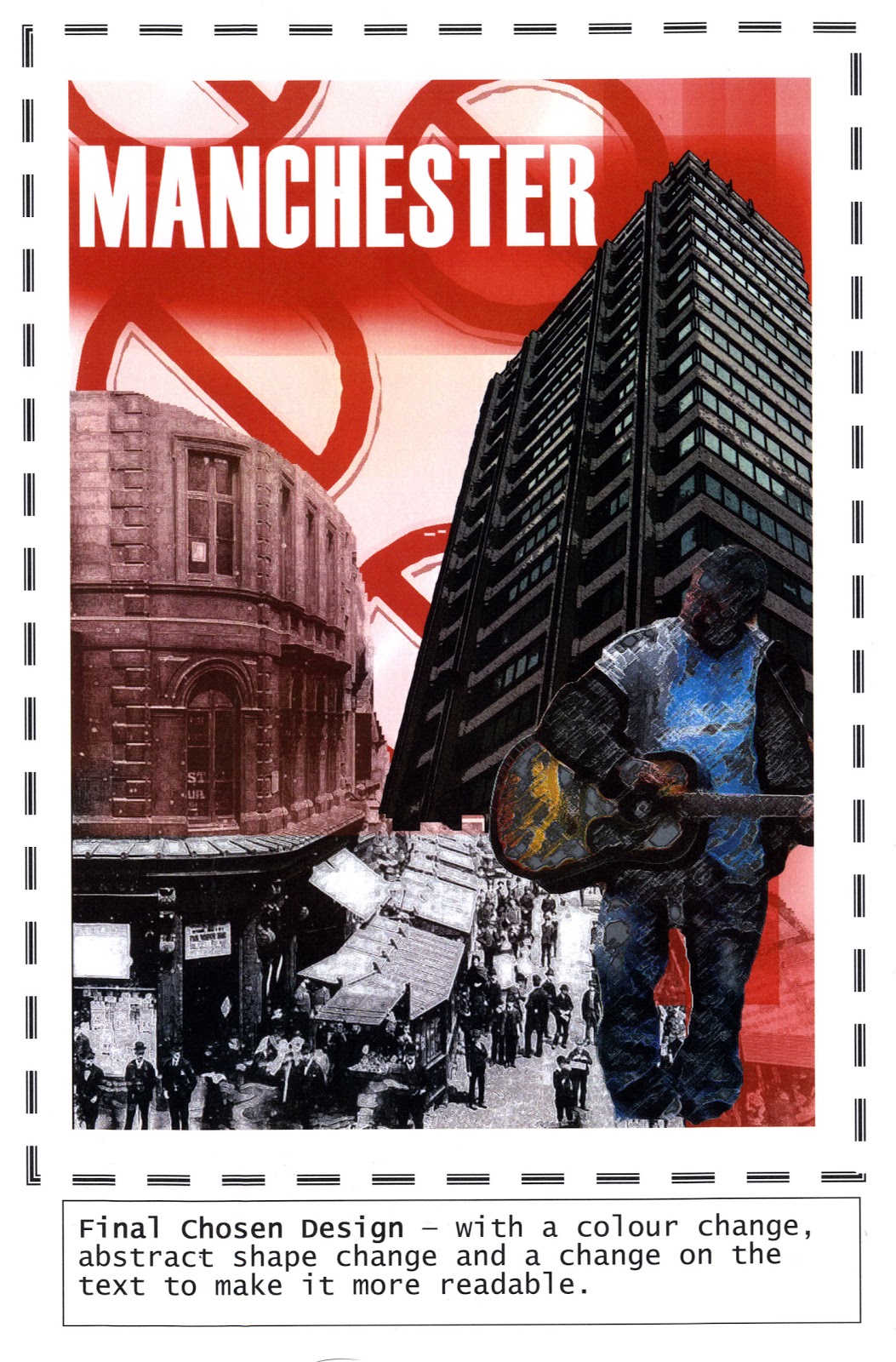
This sheet was focussing on typography, and it was my first real time using Adobe Illustrator to generate graphical text on top of an image and making it look legible. This sheet definitely helped me establish a technique on how to use Illustrator, and some of the text ideas here I have used even in my most recent projects.
Postcard Creation
This is the beginning of how I created one of my poster designs. It shows all the different components that went into making the poster, and the artist I was taking influence from. All of the components were either gathered from the internet, photographed myself or created using Photoshop/Illustrator.
Poster Development (Unit 2)
Poster Development for my second project. This showcases the 4 possible design ideas (left), and on the right, the top right image was picked and developed further to make it look like it's actually advertising something. I found this poster to be one of my strongest and thoroughly enjoyed creating this one.
Manchester Final Poster

Final Design - Unit 1
My final poster designs for my first project in college. I feel that with this project I was just trying to find myself and get used to everything, so I don't think this outcome is as good as some of my later ones. Nevertheless, it shows a use of repeated patterns and own imagery, as well as showing the different poster ideas I was considering.
Poster Ideas
An array of some ideas I produced for my second project in college. I found this project easier to produce ideas out of, and enabled for some interesting pictures. These ideas include line drawings from Illustrator, filtered pictures from Photoshop and stylized text also created on Illustrator.
Developing an Idea
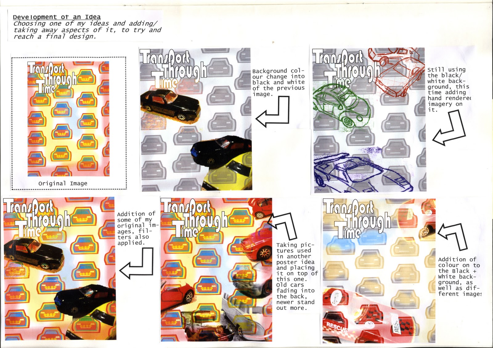
Another sheet which showcases one of my original poster ideas developing. Going from a landscape format to portrait was one of the more beneficially changes I found, but ultimately the idea was to have an outline over a collaboration of images. Each poster has this running theme.
Developing an Idea

Adobe Illustrator (exam)
This piece of work was done during my exam period. It focusses on use of Adobe Illustrator and the line drawings created using it. Using my original images (taken with my own camera), I was able to create a line drawing on Illustrator and add block fill colours. From these coloured images, I could create repeated shapes or different patterns.
Brainstorming
A sheet from my latest project. I was researching the work of the film director Christopher Nolan, and wanted elements from each of his films. As I already had prior knowledge of his films, it was just a matter of presenting it so it makes sense to someone looking through my sketchbook.
Adobe Photoshop Techniques
This sheet from my latest project showcases various effects and filters I have used on Adobe Photoshop. Not all of these I would later use for my final poster design, but it just shows the variation in imagery I have available at my disposal. Shown here are colour edits, brightness/contrast edits and crops, all done on Photoshop.
Subscribe to:
Comments (Atom)


