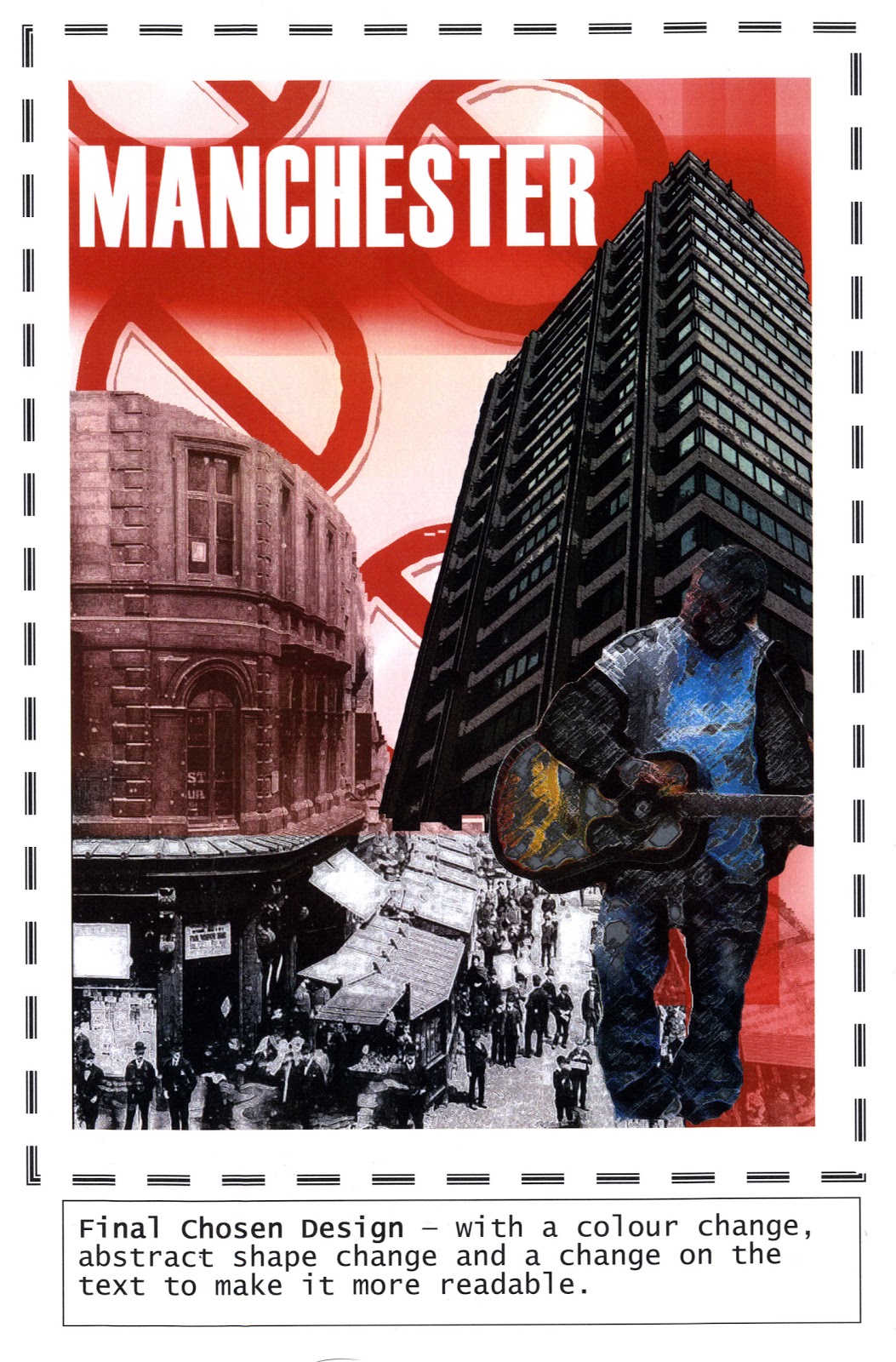
My final design closer up. It shows how I have fused some of my own imagery (the ones on the right) with ones gathered from another source. The idea was to produce a poster advertising Manchester, so the images were taken by myself out in Manchester, so I could accurately portray first-hand what it is like on a poster. I wanted to give a 'congested' feel, hence why the imagery is placed so close together.

No comments:
Post a Comment